Learned a new technique which--it seems to me--is akin to the clarity slider in Lightroom and Photoshop. Scott Kelby demonstrates it in a
video (@54:00 min) and he calls it adjusting the tonal contrast of an image. As you can see in the comparison below the details jump right out in the image that's had tonal contrast adjustment. It looks sharper as well.
Here's how I processed the raw image (it's one of those from the
October 22 shoot).
- Open the image in Photoshop and flatten if necessary (the "invert" function is grayed out when the image opens as a smart object)
- Create a duplicate layer
- Change the blend mode to Vivid Light and set opacity to 50%
- Invert the image (CTRL-I in Windows)
- Apply Surface Blur using a radius of 40 and threshhold of 40
- Make a merged layer by pressing CTRL-SHIFT-ALT-E
- The moon image was already monochrome but if it weren't then I would have to desaturate by going to Edit > Adjustments > Desaturate
- Turn off or throw away the layer created in step #2
- Change blend mode of the merged layer to Overlay and set opacity to 75%
- Create a duplicate layer and change blend mode to Multiply and set opacity to 60%
- Create a mask in this new layer by clicking on the mask icon
- Use a brush size much larger than the moon (I used 900 px) with 50% hardness and 100% opacity
- Click on the mask to select it, choose black as foreground color, position the ginormous brush so that it covers the portion of the moon that's now underexposed (the portion closest to the transition between night and day on the moon), and click just once. This prevents Multiply from affecting that area. The 50% hardness creates a smooth masking transition
- Decrease brush size, increase brush hardness to 100%, change foreground color to white, and paint in all of the areas in the image that should be pitch black -- the portion of the moon unlit by the sun, which the 900px brush had masked out
As far as I can tell Kelby's method entails using 100% opacity for the Vivid Light and Overlay blends. But I found that was too much for my taste vis-a-vis the moon images. That's the reason I tamed the opacity down. The Multiply layer is used to darken the image a bit to bring details out in the highlight areas. The use of the mask prevents the already rather dark areas from getting even darker.
In the Oct 22 shoot I had taken the images with the camera facing south and tilted upward--because that's how I was looking at the moon. Here I've rotated the pictures 90 degrees so this is how the moon would look if you were looking east and tilting your head waaaay back (and getting severe neck pain).
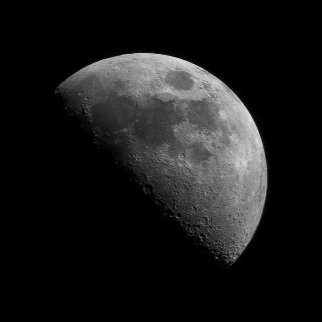 |
| Canon EOS T3i, 1/10", f/11, ISO 100 EF 75-300mm @300mm No tonal contrast adjustment |
 |
| with tonal contrast adjustment |
I also tried out tonal contrast on a full moon pic. The results are lackluster as you can see below. And the reason being that a a full moon is just like a subject lit with a camera's pop-up flash, while a crescent moon or quarter moon (as in above) is sidelighted. The former will look monotonously flat because of the lack of shadows.
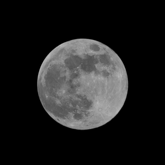 |
| Canon EOS T3i, 1/100", f/11, ISO 100 EF 75-300mm @300mm No tonal contrast adjustment |
 |
| with tonal contrast adjustment, 50% Vivid Light and 100% Overlay |


No comments:
Post a Comment